Extending personalized healthcare to West Michigan, simply.
Website UI
Client
Spectrum Health is a 20-year-old healthcare system comprised of 31,000 team members, 4,900 physicians, and 14 hospitals in the West Michigan and South Michigan area. In 2021 they began the first phases of their rebrand rollout which included a website redesign.
Challenge
Using the UX strategy developed by the internal Spectrum Health team as a foundation, design an interface that reflects the new brand direction Spectrum is taking and shifts the focus of the site to user experience and new customer acquisition.
When I joined this project, the objectives had already been set by the internal team. The redesign goals pertinent to my work were:
Redesign Goals
01.
Shift the focus to the consumer by providing an immediately more welcoming experience and connecting them quickly with the information they need
02.
Redesign search experience to allow for ease of healthcare provider and location discovery
Aesthetic Exploration
When first designing the look and feel of the new site, we created some quick initial comps to get comfortable with which type sizes and weights were the most attractive and readable, what kind of photography application was appropriate, and how the new brand colors should be applied.
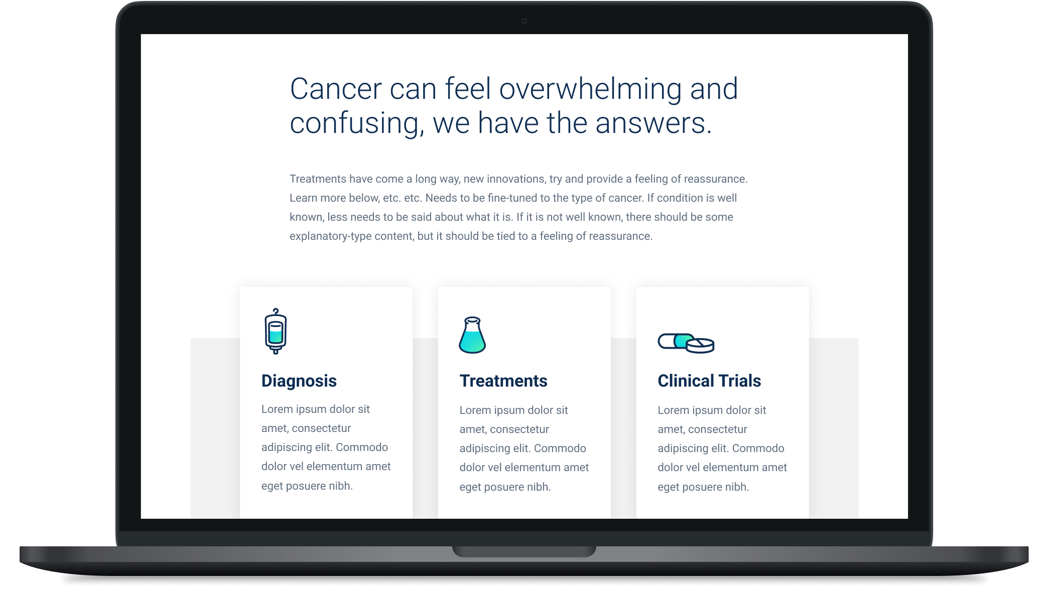
In general, we knew we wanted to avoid the long lists and dense copy that dominated the former site and develop a component system that felt airy, informative, and not overwhelming.
During this process, we had to be mindful of accessibility standards in order to ensure that as a healthcare provider, Spectrum was serving its customers in the most inclusive manner possible.
Early Exploration: These quick comps were created to explore typography, color use, and other aesthetic options while maintaining accessibility standards.
One hiccup we encountered was that the brand heavily relied on navy text over a full-flood gradient background to create impactful messaging, but unfortunately, this approach did not meet contrast ratio requirements for accessibility.
Since using this convention was not an option, we found an alternative application for the gradient—using it for small elements like button outlines as well as a background flood with white containers above it. This allowed us to portray the brand in an impactful way without hindering the experience of the user.
Visual Systems
Once we established a general aesthetic direction, we got down to the nitty-gritty and developed type styles for both desktop and mobile as well as buttons, text fields, check-boxes, and radio buttons.
In order to ensure consistent application by designers and execution by developers, we created reference guides exemplifying hover and focus states for buttons and forms and a typographic guide complete with margin requirements and rules for collapsing them.
Hero Designs
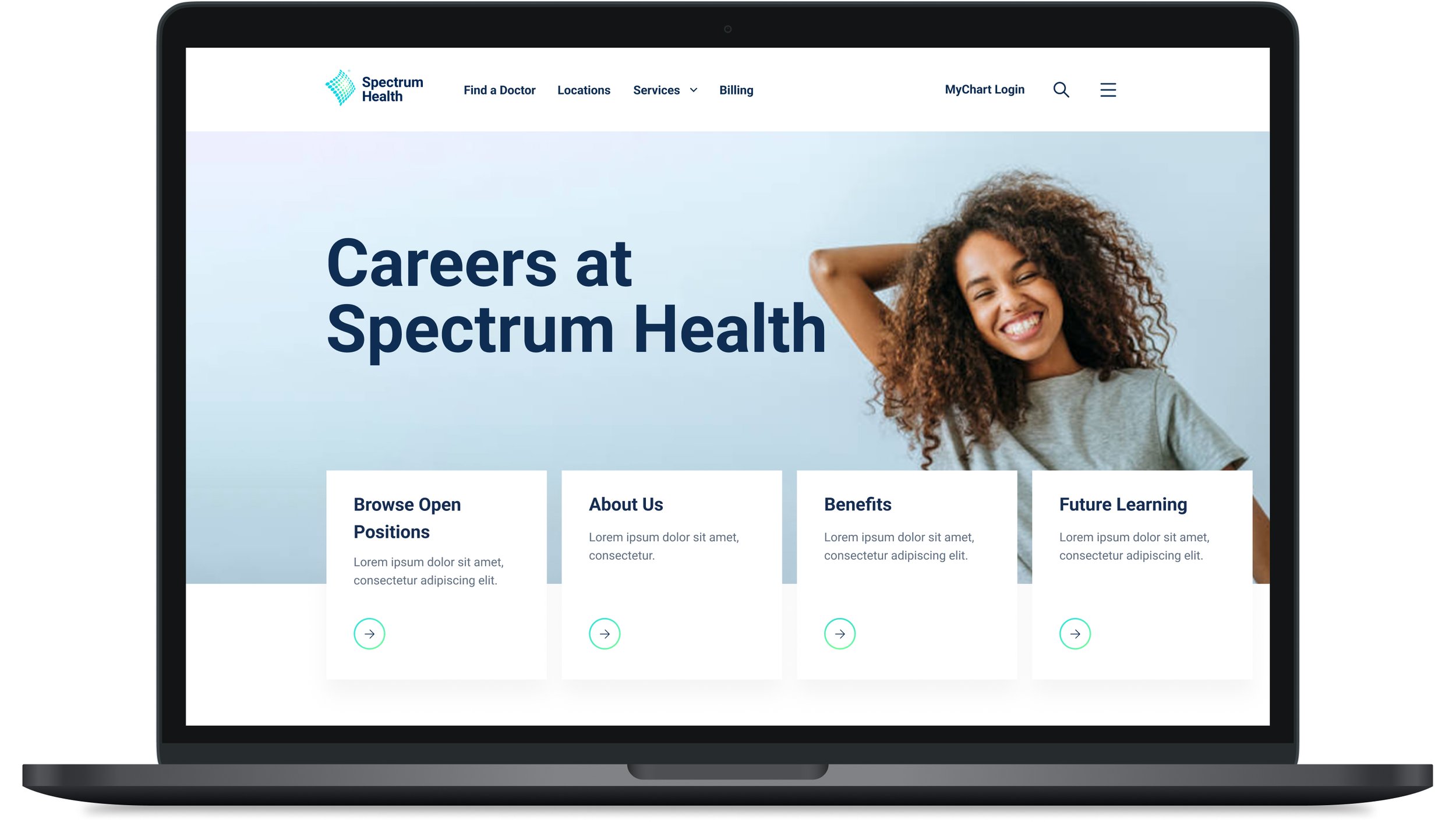
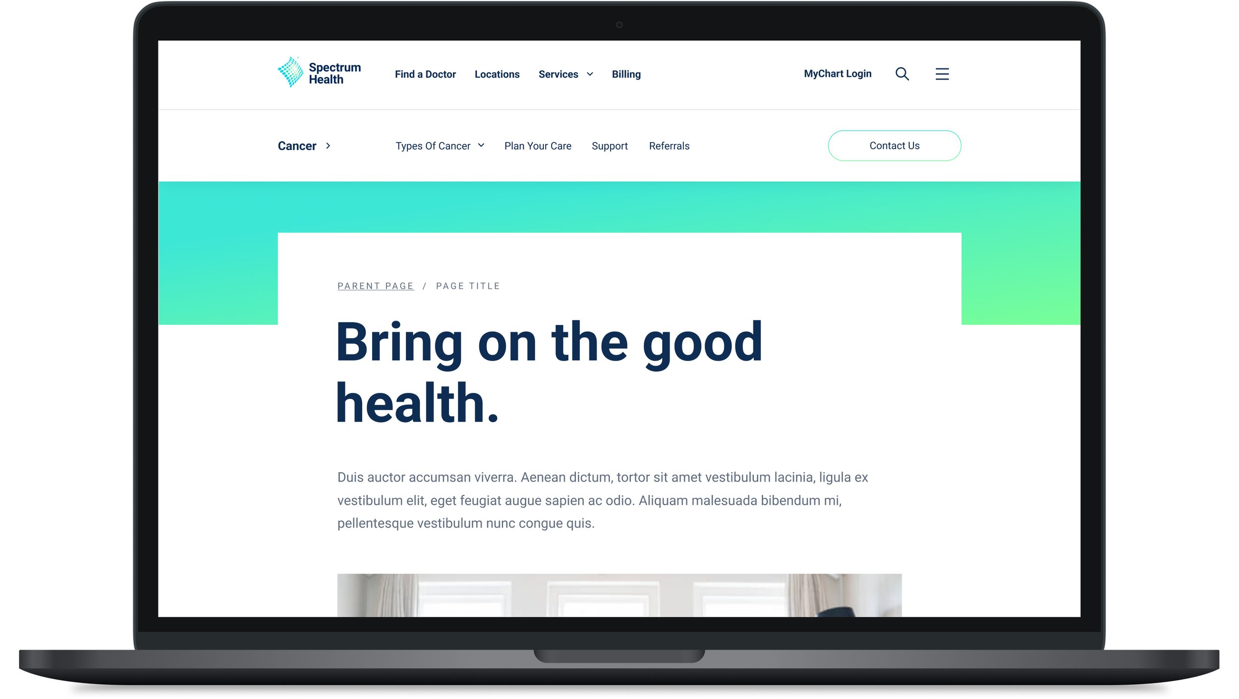
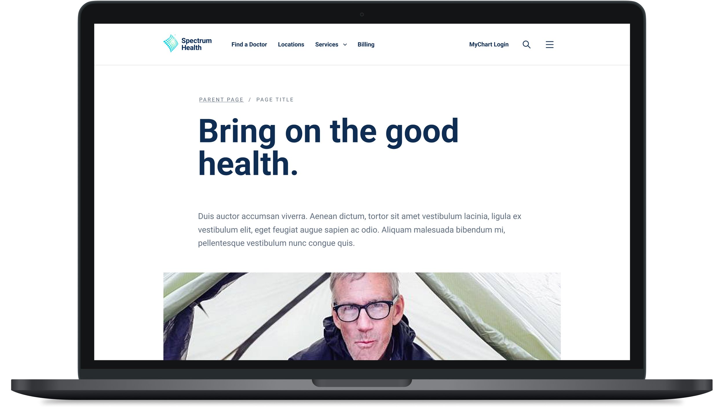
Then we moved into the more structural pieces of the UI, beginning with hero designs. The former Spectrum site had two hero options, one highly impactful option with imagery and several links and one text-based hero style with just a headline.
We knew that greater options would not just empower admins to create more compelling and user-friendly layouts, but also give the user a visceral understanding of how “deep” they are in the site, relating back to goal number one (customer focus.) As a result, we designed a high impact, medium, impact, and low impact hero options that can be used at the content curator’s discretion.


Former Search Functionality
When beginning our redesign of the search experience, we first analyzed the former search process and identified a few key issues.
01.
Global search did not provide any prompts to the user to inform search options or guide them to potentially relevant information.
02.
Search result cards were collapsible and hid valuable information in some cases and were confusing to interact with.
03.
Searching for a doctor or location navigated you to a subsite called “find a doctor,” interrupting the natural journey of the user through the site.
Former search experience
New Global Search
The new global search includes suggestions to get the user started as well as intentionally designed result cards featuring information that was determined to be most important to users during a series of interviews. It relies on the same filters as the former search structure, with a more elegant visual approach.
Provider and Locations Search (Embedded)
While there are still pages fully dedicated to finding a doctor and a location via search, the search component used within them can also be embedded directly into any page, which avoids interrupting the user journey by redirecting them to a subsite.
For example, if a user is exploring cardiology and casually looking for a doctor, they can search for a cardiologist or a Spectrum Health location near them without ever having to navigate away from their current page.
"Find a Doctor” page
Embedded Search examples
Card Design
As mentioned previously, the details shown on each card are based on what users deemed most important to them during a series of interviews—giving them the majority of the information they need without requiring them to click away from their current position.
These cards were designed with 3 different states to enable a multitude of uses. Not only will they populate as a search result, but they also can be used within a page in a grid or slider to feature any content, provider, or location the admin wishes.
The Final Product
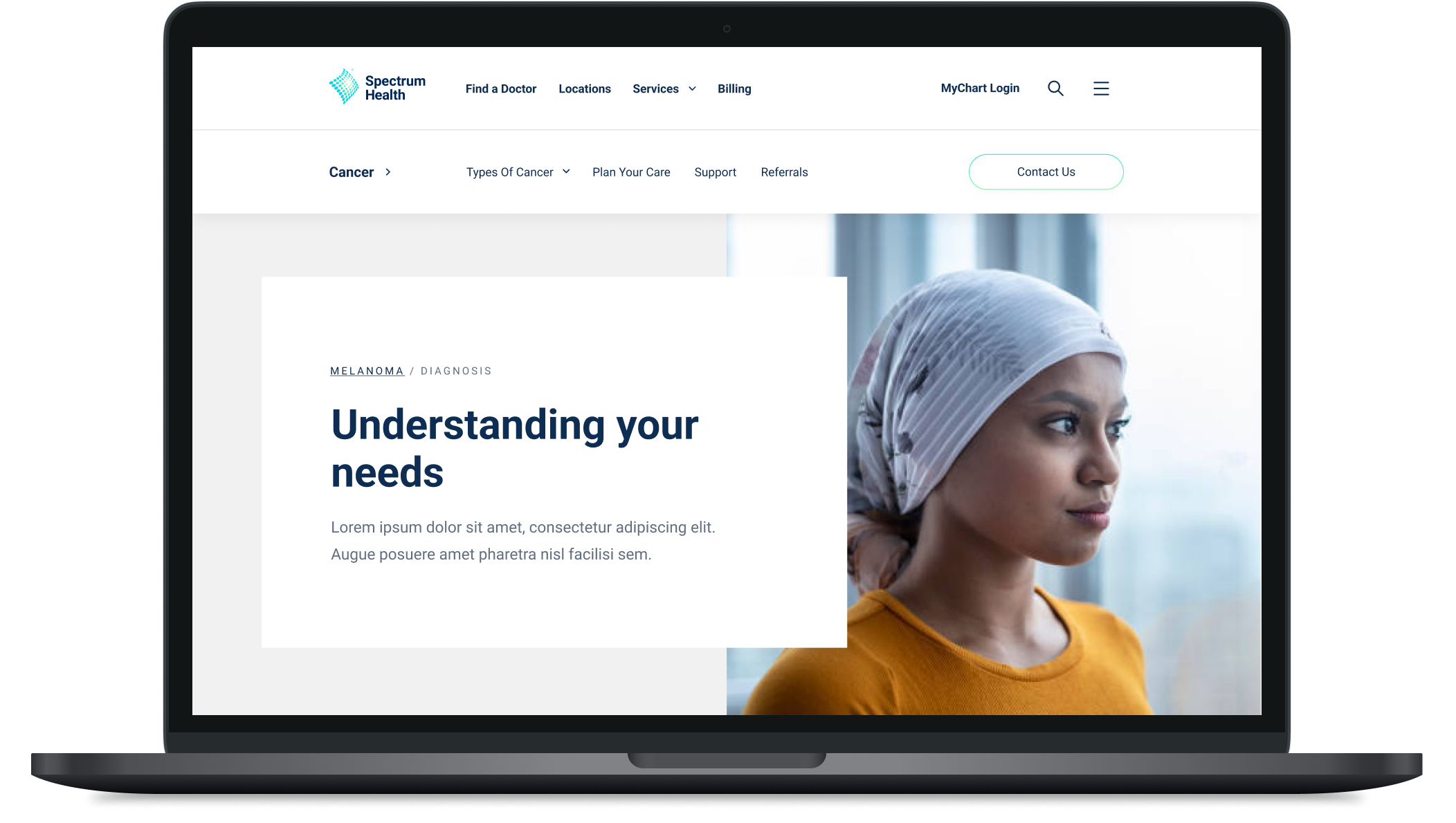
In combining the airy approach to the look and feel of the site with strategic interface design decisions, we were able to achieve a final product that solved many of the problems of the previous site and showcased the new brand in the best light.

Outcome
Overall, Spectrum’s brand designers, internal team, and leadership were all thrilled by the outcome of the design work we conducted. We are looking forward to hearing the public response to the new site experience and hope to continue to refine the experience based on its reception.
Brand Design and Project Management
Baas Creative
Design Lead
James Mikrut
in collaboration with the Spectrum Health Design Team


