Structure and strategy for a does-it-all community wellness organization.
Website UX
Client
Hope Network is an organization that provides a variety of social and healthcare services to over 34,000 people in Michigan annually.
Challenge
Connect people in need with Hope Network service lines while supporting high-level organizational goals through a full website redesign.
Our process started with identifying Hope’s goals for the new site and their organization in general and narrowing their target audience for the redesign.
Redesign Goals
01.
Connect people in need with Hope service lines through a referral system
02.
Continue to hire quality employees for direct care and more specialized roles
03.
Create opportunities for users to donate to the Foundation and various fundraisers
04.
Educate all users about the offerings and values of Hope Network as an organzation
Former site page examples: 1. Neuro Rehabilitation Landing Page 2. Former Home Page
Existing Site Audit
Among a plethora of usability and aesthetic issues, we were most concerned with the site’s overall structure and navigability.
If there were one word to describe the experience, it would be overwhelming. The homepage alone included over 50 clickable links—and that didn’t even include menu and footer items.
While clearly and concisely communicating the broad variety of services that Hope offers is a tall order, it’s also a crucial part of meeting their users where they are. Most people looking to access Hope Network’s services are in times of crisis, stress, or even desperation, an overwhelming interface is simply not an option.
Their site analytic reports supported these observations. With a homepage bounce rate of 62% and the majority of their traffic coming from prospective job-seekers, they were failing to reach their primary audiences including people in need and referral sources.
Former site navigation: 1. Hamburger menu 2. Services menu 3. Footer nav
Pain Points
While observing test subjects attempting to complete tasks such as “apply for affordable housing” or “make a donation to the Hope Network Greatest Needs Fund” we identified a few consistent pain points across the board:
01.
Users can’t find proper service line information because they are being pulled in too many directions at once.
02.
Offerings are unclear and the user gives up finding valuable information after one or two clicks.
03.
Referral links hidden amongst dense menu content and are difficult to find, no central location for all referrals
04.
Templates are extremely limiting and leave little room for compelling visual design.
Structure
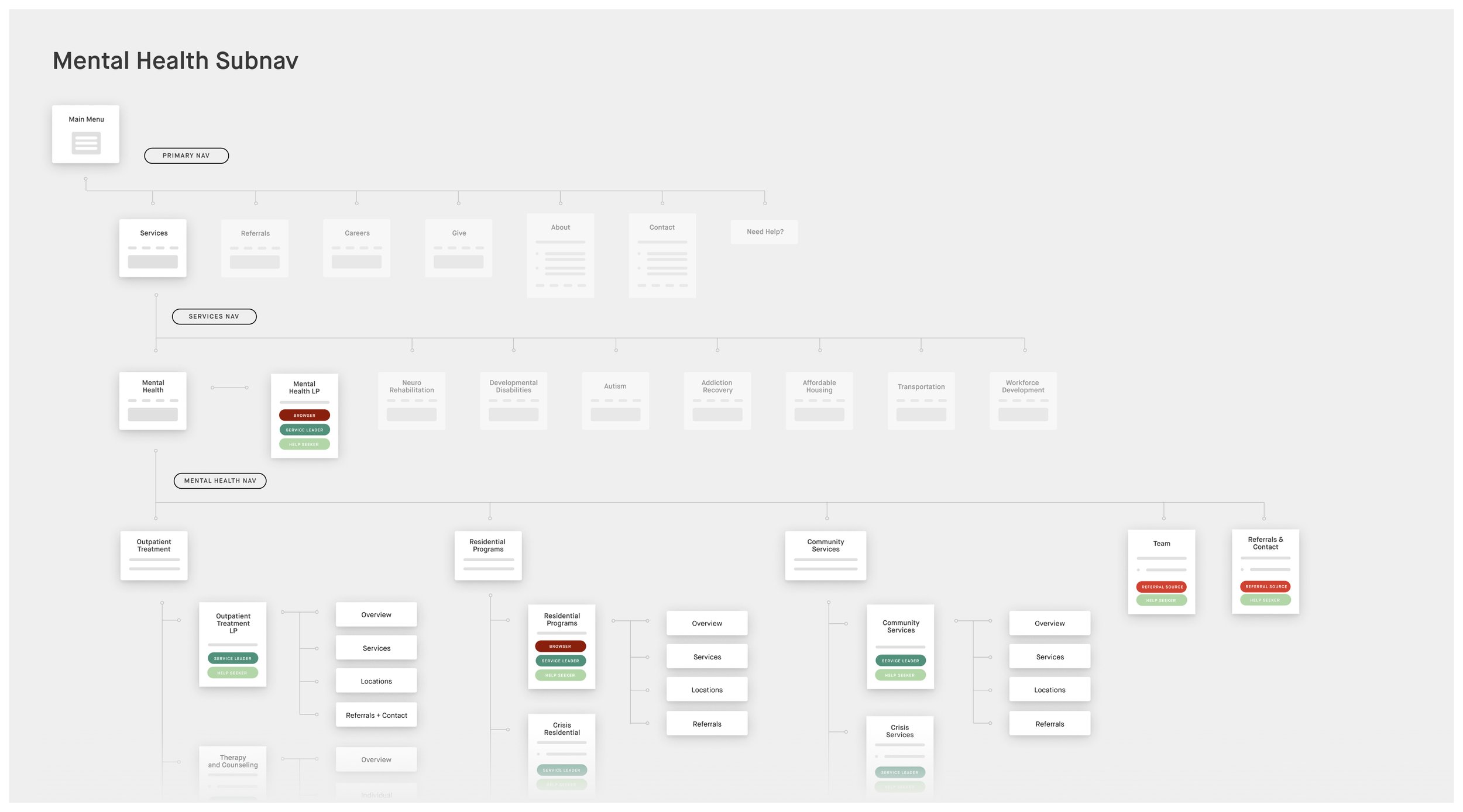
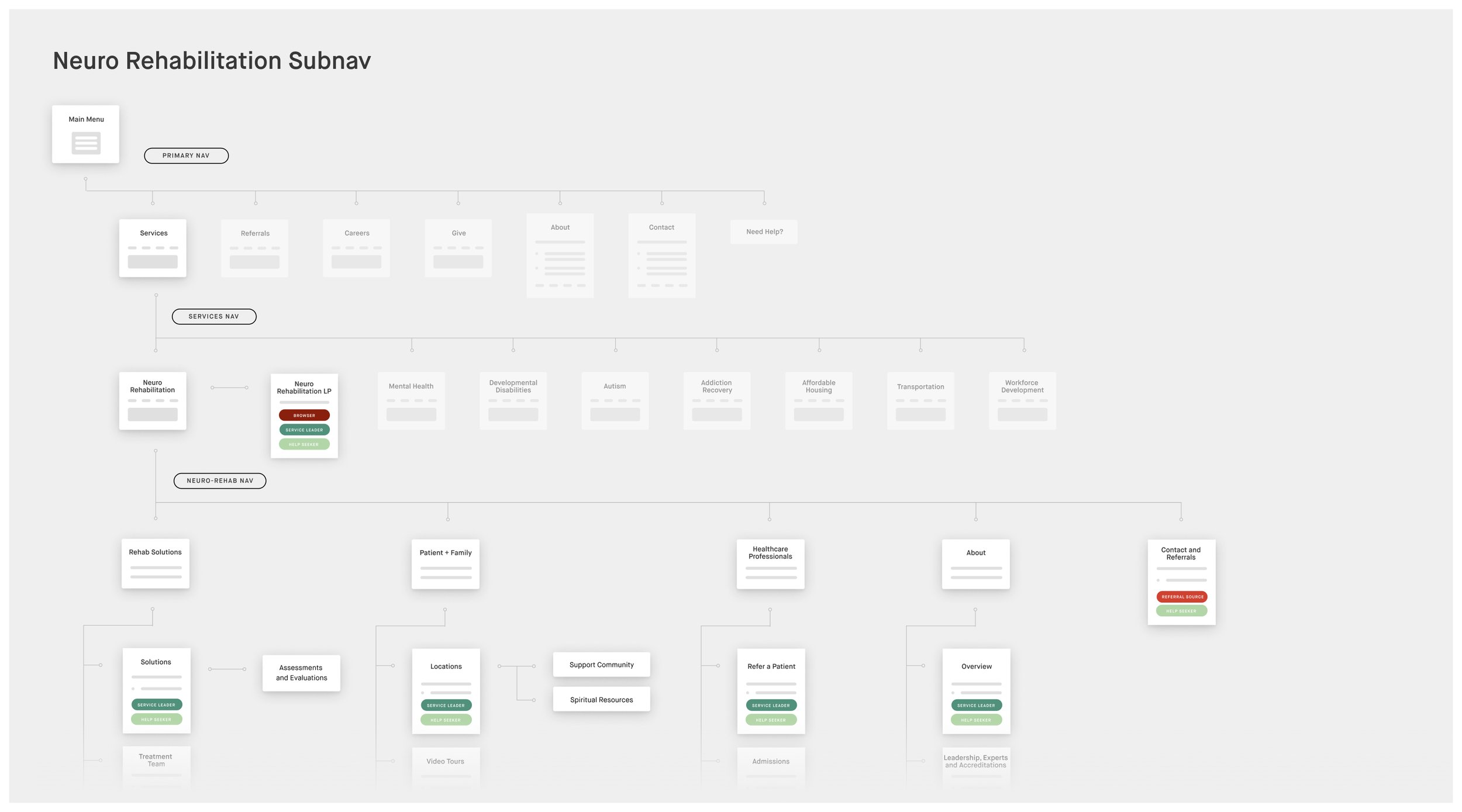
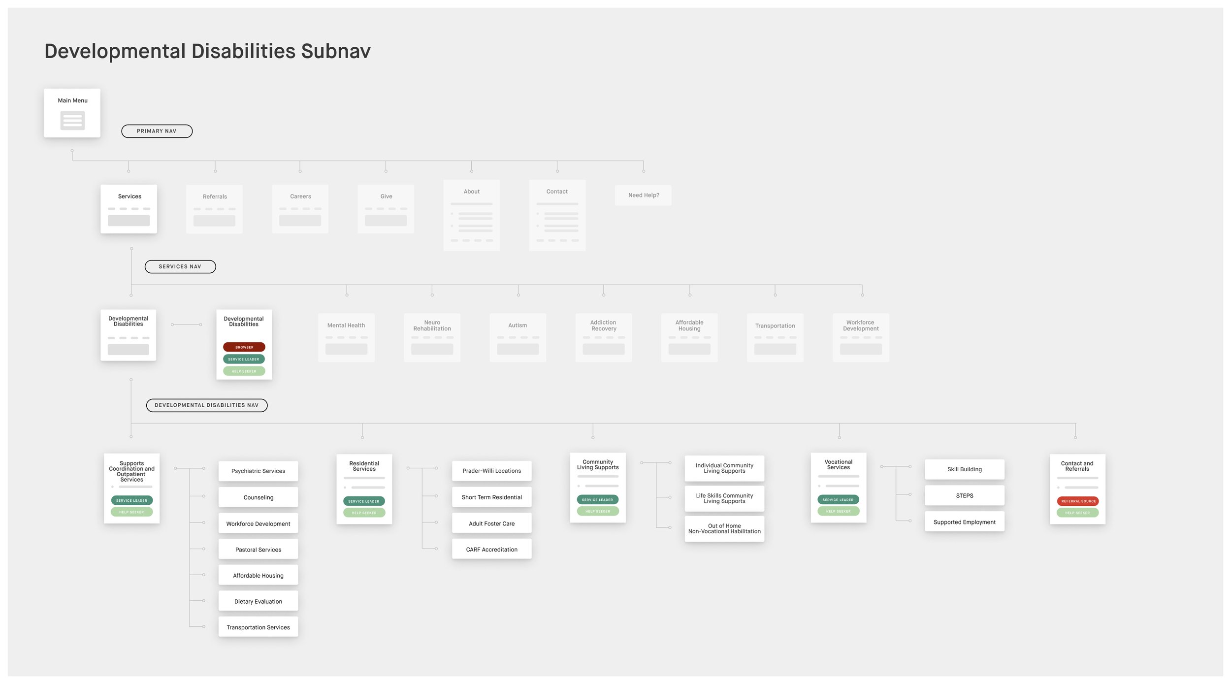
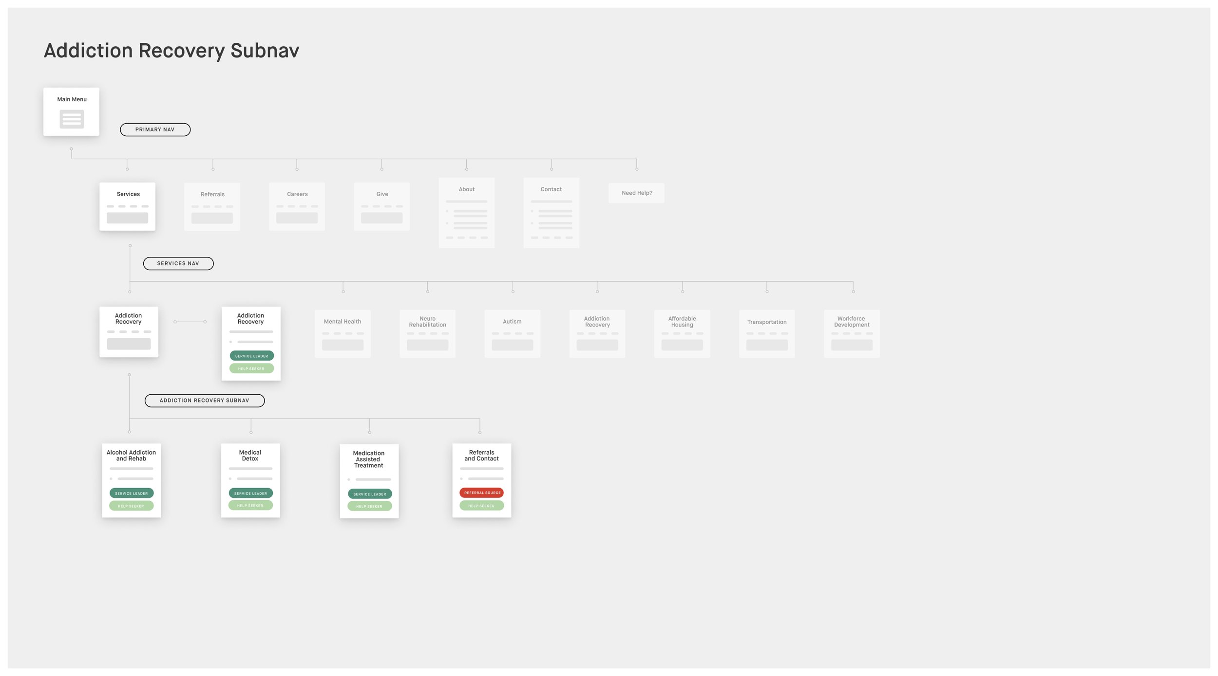
We decided to use Hope’s four primary goals as the foundation for the site’s global navigation with narrowed options under each high-level category.
During site mapping, we laid the groundwork for the high-level site structure. The global navigation would call immediate attention to the four primary goals of the redesign by offering services, referrals, careers, and give as primary action items.
Primary nav options are based directly on the four goals identified in the exploration phase
From there, we knew a secondary menu system would be required to to avoid the messy in-page navigation options in the existing site.
We had a vision for a custom header nav specific to each site section—allowing users to access pertinent information and referral sources intuitively.
We were able to develop these top-level nav categories within each site section through affinity mapping. We relied on team members and volunteers to categorize the existing pages based on their immediate associations with the content to generate a majority-accepted consensus as to how the nav should be structured.
Wireframing and Component Library
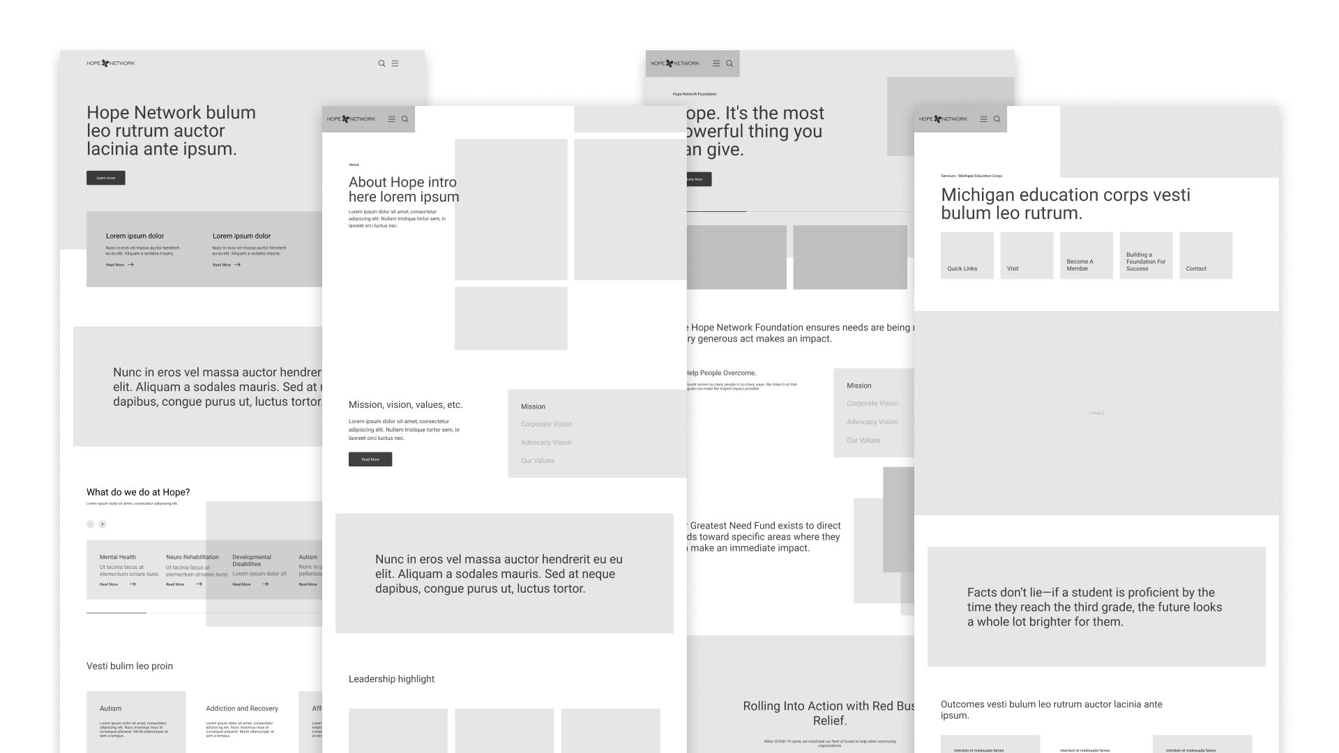
By the time we began wireframing, we had a very thorough understanding of the site content, the ways it was being displayed currently, and how we imagined that could be improved.
We developed a component library intended to reduce the need for long form copy, highlight compelling imagery, feature a variety of highly clickable items to speed up the user journey, and introduce a sense of ease within the user through an airy, less-technical aesthetic.
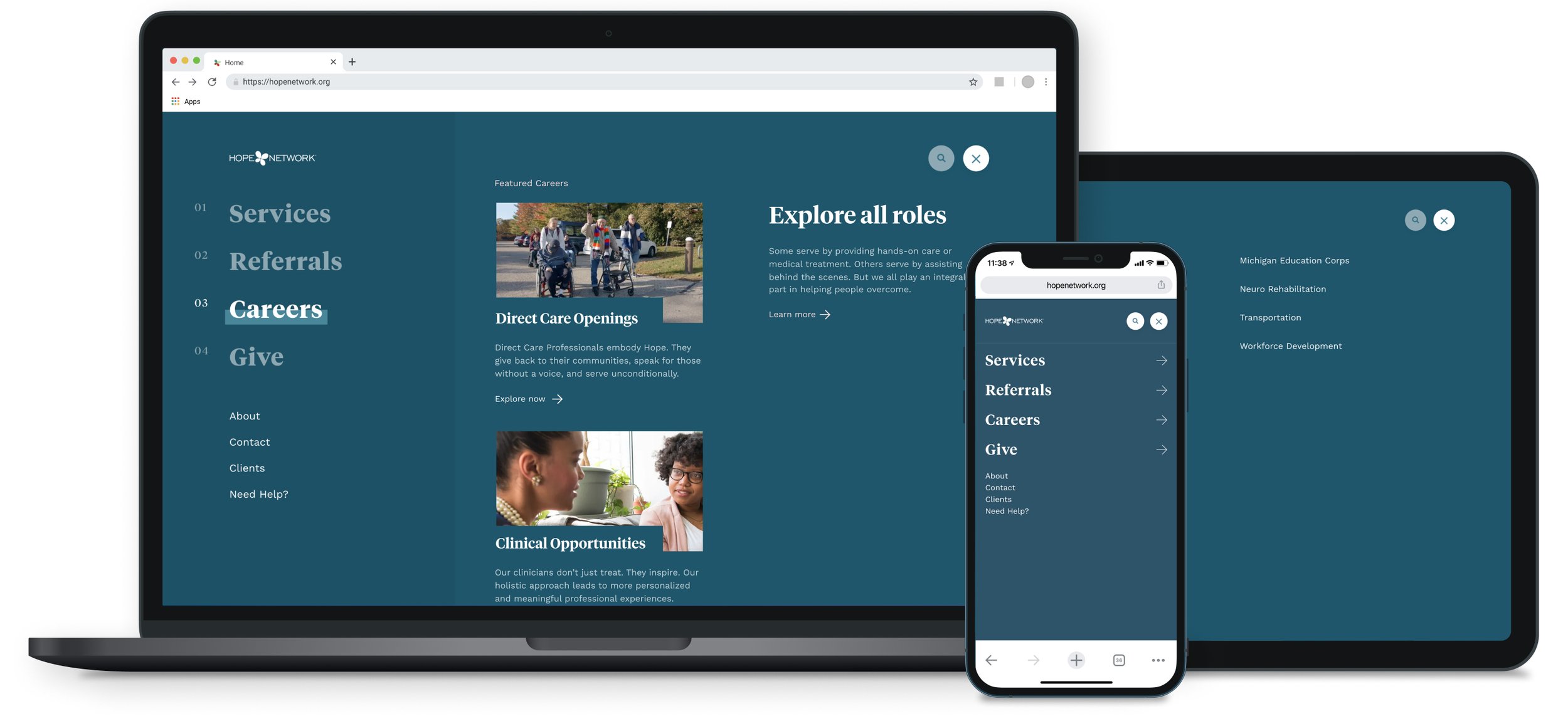
Global Nav UI
The UI directly reflects the intention behind the menu structure indicated in the sitemap and wireframes. Each lefthand menu link opens a secondary layer of nav options to help funnel the user directly where they need to go within an extremely information-dense site.
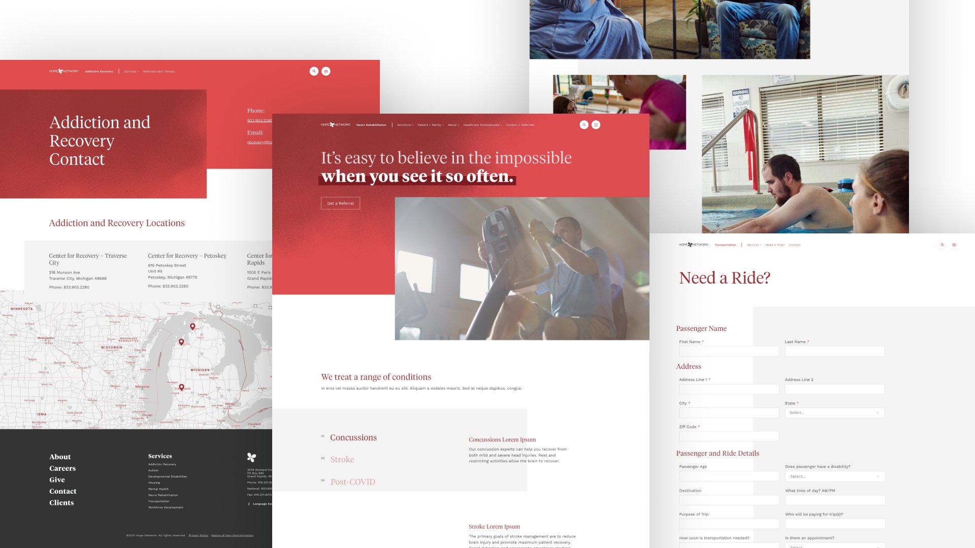
Subsite Concept UI
The subsite-specific menu systems fit seamlessly alongside the global nav and dynamically change based on the user’s position in the site. These menu systems were designed for flexibility to support simple links as well as more comprehensive drop-down menus when necessary. Within drop-downs hierarchy can be established through typographic scale and featured content such as articles and blog posts can be displayed.
To further emphasize the idea of service sub-sites, we dedicated a specific color theme to each service line. Color-coded pages act as a positioning tool to help the user quickly determine where they are. For example, in the Autism site section, every page shares a blue theme. If the user navigates away from Autism into Addiction Recovery the whole theme changes to red—a clear visual indication that a new service line has been accessed.
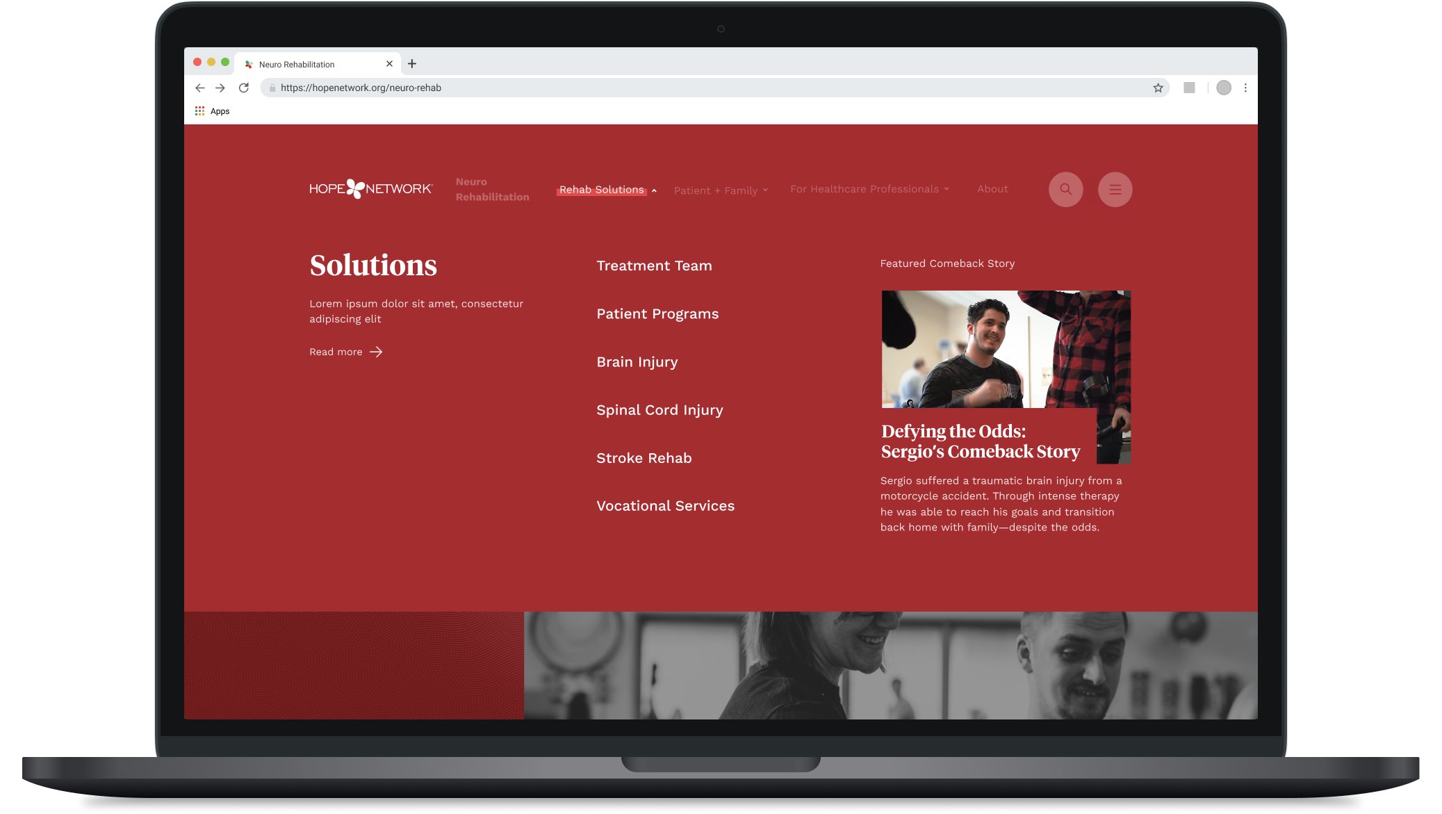
Neuro Rehab Nav / Solutions Menu
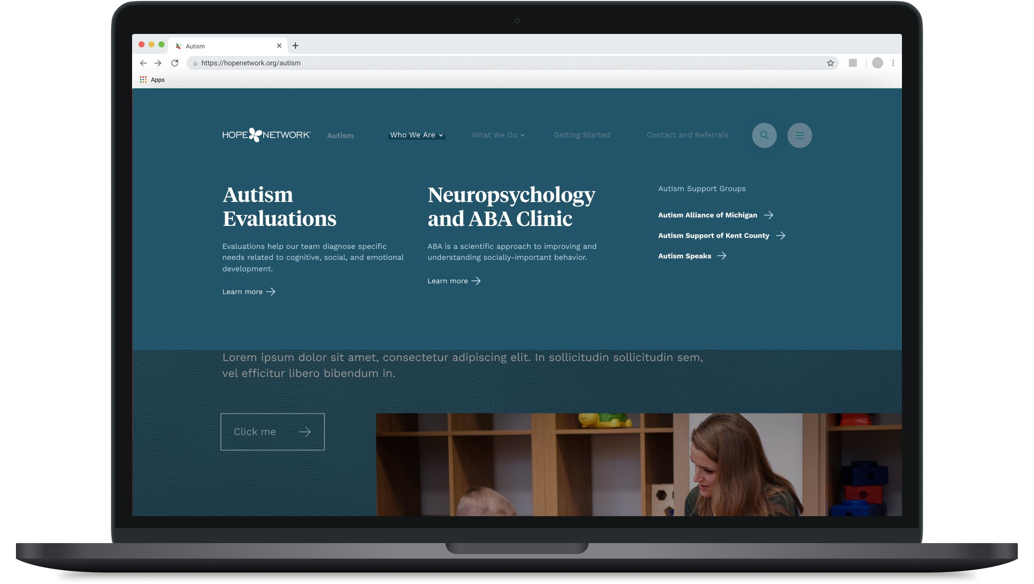
Autism Nav / What We Do Menu
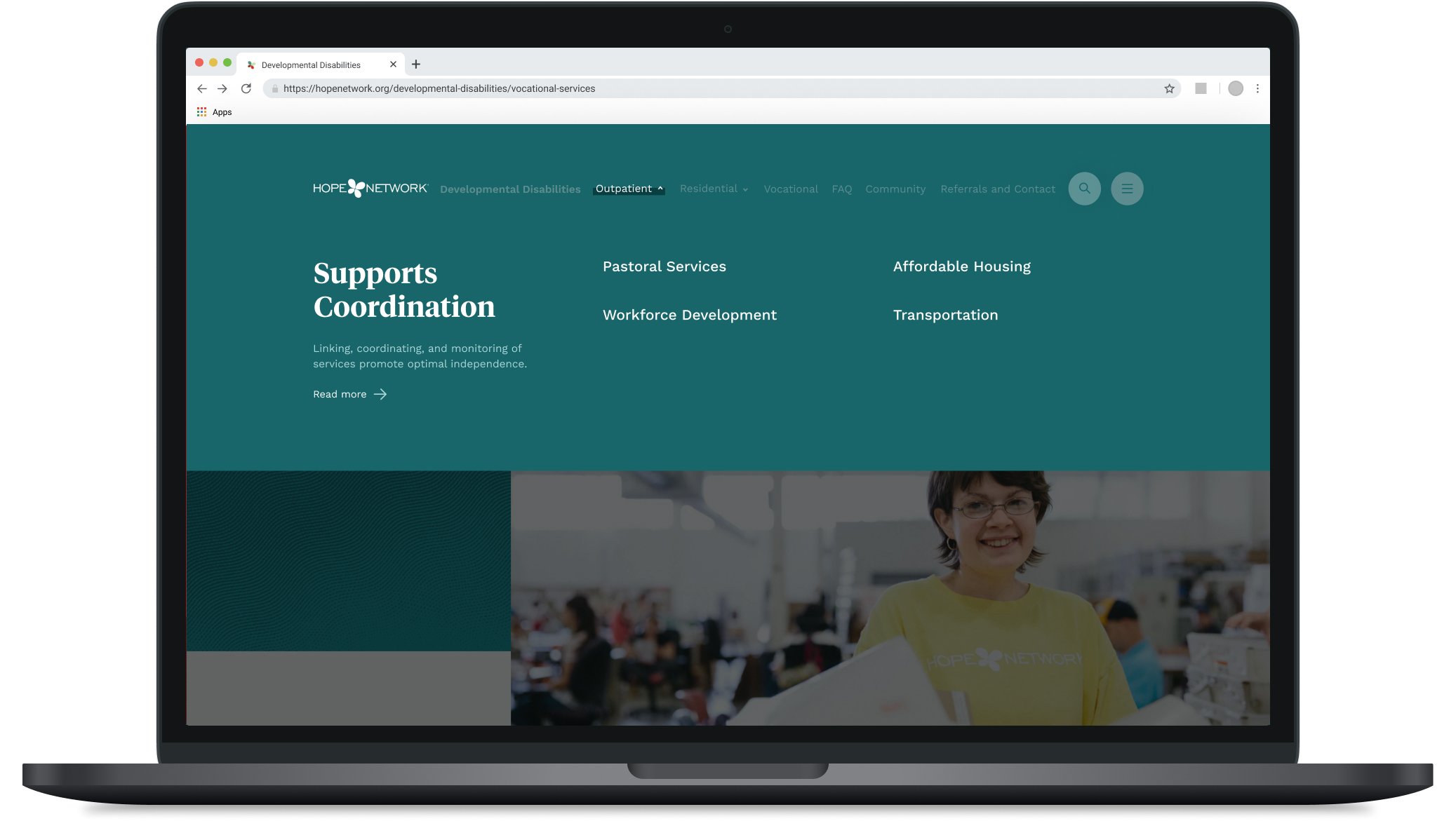
Developmental Disabilities Nav / Outpatient Menu
Layout-Building Component UI
As intended, the UI of the component library reflects the intention behind the redesign strategy—larger font sizes, compelling imagery, intentional use of negative space and purposefully limited copy give the user room to breathe when using the site. Rather than searching through a plethora of tiny links and dense long-form copy, they can now navigate intuitively while digesting page content with ease.
Outcome
Overall, this redesign has empowered Hope to showcase their services effectively, increased referral efficiency, and delighted users experiencing it for the first time.
This project was led creatively by James Mikrut, site architecture and experience designed by Andi Rozell in collaboration with Jacob Fletcher, interface design and development by James Mikrut and Jacob Fletcher. Project managed by Sean Zubrickas.


